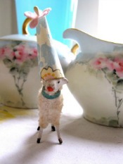
I’ve been a wee bit obsessed of late with trying to change the font on my banner to something… different. I was never really crazy about the old font. Here was the problem: I had saved the basic banner without text so that I had something to play with should I want to change the font. Every photo editing program has its own group of fonts. I don’t like the basic, sort of ho-hum, fonts, so I was going from program to program trying them all out. If one program had a font I liked, I couldn’t figure out how to add it to the basic banner without the font getting distorted. If I found a program where I could do what I wanted, I didn’t like the fonts. Believe me when I say that I tried out various fonts endlessly. Endlessly. Over the course of several days.
Like a dog with a bone, I do not give up. Along the way, I learned some things.
1. If you’re interested in some nifty handwritten-type fonts, check out Fotoflexer. They have so many cool, original looking fonts. And most of them you will not find on Blogger or PicMonkey. Fotoflexer is a free photo editing site you might really like.
2. If you keep trying, as I did, to add the new text/font as an overlay (which you can do quite easily in PicMonkey), very often you will find a sort of shadow around the text. Very frustrating. I finally went to Pixlr, where I created a new file with just the text in the font I wanted, erased the background and made it transparent. I did the same thing with the birds and lambs when I originally made the banner. It is painstaking work but it’s worth it in the end. Here is the link I discovered that showed me how to do it.
3. I know that graphic designers know this, but I sure didn’t. After adding the new font overlay to the banner, I noticed a distinct difference in the quality of the graphics when I made it a .png file. I tried it both ways: as a .jpeg and as a .png file. Jpegs are great for photos, but a little research told me that .png files are best for graphics. The font in the title of my banner was not distorted in the .png file. It was distorted in the .jpeg file.
4. The font I’m using is one I found at KevinandAmanda. This great site offers lots of free fonts which are easy to download. On my computer, which is a Mac, the fonts are automatically added to my Font Book, and when I went to Pixlr and checked out the fonts there, lo and behold, the program accessed my fonts and I was able to use my favorite for the new banner. KevinandAmanda give very clear instructions for downloading the fonts.
5, And, Picnic lovers, here’s some good news. I can’t take credit for discovering this. I read it yesterday on The House of Smiths in a post about photo editing. There is a new site called Ribbet that is EXACTLY like Picnik. I mean it. Exactly. It clearly was created by a former Picnik person. The collage feature is exactly the same. The fonts are the same. The frames are the same (one of you mentioned the Postage Stamp frame to me in a comment – it’s there!) If you loved Picnik, run there, do not walk, do not pass go…you get the picture.
I hope this information is helpful. I sure like learning something new, don’t you?
Riley is hanging in there. Scout is much better. It’s been just over a week and she’s almost back to her normal, feisty self. I’ve never been so happy to hear her bark or witness her nagging ways.
Have a great Wednesday.


This comment has been removed by the author.
Good Morning, Claudia
One more thing about Ribbet; the premium tools are currently (temporarily) free to those who register.
-Karen
Even though I don’t blog, I LOVE fonts, especially really unique ones! Not long ago, one of my friends gave me copies of some nature info, and on it, was the most beautiful little note from her. I said “Oooh, I love this font, where did you find it?” She laughed and said “thank you”, it’s my handwriting! I told her if I knew how, I’d make that into a font and use it every day; it was beautiful and easy to read; too bad I’m not that talented.
Glad Scout and Riley are hanging in there! If you’re like me, some days you feel like you’re running a pet hospital; but aren’t those doggie kisses worth it all?
Stay cool if ya can!
I’ve been playing with Ribbet this morning. It is EXACTLY like Picnik. It is simply Picnik with a new name. So glad it’s back! Waiting on Judy. We’re going junking! Yea!
Brenda
Hi Claudia, Thank you so much for all of this great info. I know I’ll refer to this blog post over and over. I LOVE your new banner font–it’s just fantastic!!! So glad your babies are getting better and hanging in there. They’re in my thoughts and prayers all the time. xo Jennifer
Good news about the pups…I’ve gone from Picnic to Picmonkey..Picmonkey has way more to offer than the free version of picnic..Will look in to Ribbet..Thanks..
Good news about the pups…I’ve gone from Picnic to Picmonkey..Picmonkey has way more to offer than the free version of picnic..Will look in to Ribbet..Thanks..