Hello, everyone! Welcome to my newly designed blog!
A while back, I started enlarging my photos. I sought the advice of a few people, among them Cindy of My Romantic Home. Because of the limitations of the Blogger template I was using, I could only enlarge photos vertically (portrait.) That was fine for a while but sometimes I wanted to shoot horizontally (landscape) and in the course of cropping and trying to adjust the size for the template I would lose part of the photo. Frustrated by the same thing, Cindy recently redesigned her blog so that the width of the posting area is greater, allowing space for either size photo. She inspired me.
I loved the look of my blog. That was what held me back. (Change is hard sometimes, isn’t it?) But to be perfectly honest, though I loved the free background, I didn’t like running into it elsewhere in blogland. I wanted my-very-own-mine-only look. I also loved the sidebar labels, signature and blog button Mandy created for me. I wanted to keep them. I finally bit the bullet and asked Amber of Sprinkles on Top if she could design a new template, background and banner. She did. I am over-the-moon about this new look! Amber captured exactly what I was looking for. She is so good at what she does and is a joy to work with.
If you’re thinking of a re-design, visit Amber’s website. She is reasonably priced and has several different packages available. Amber has designed Cindy’s blog, Elyse’s blog and many, many others. Thank you, thank you, Amber!
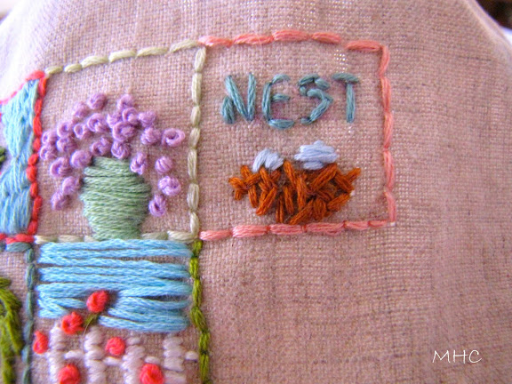
Square #10:
Pardon any white dog hairs you might see. They are part of living with a white dog that has hair as silky and fine as a cat’s. I must admit that I was stumped for a while yesterday. It took a while for a bit of ‘square inspiration’ to hit me on the head. And I have 29 to go.
Have a great day.


Hey Claudia,
Beautiful blog! Very nicely done. Your 10th square is really cool, I like it a lot, but then I love anything to do with birds. Take care.
Hugs,
Meri
love the new blog…quite beautiful! I am especially happy to see your McCoy pottery abck in the banner, you know how I love McCoy!
Your new blog is *beautiful* and I love the square, I wish I knew how to embroider, I keep bugging my mom to teach me :)
Hi Claudia,
I noticed your new look before I read a single word. Yowza! Love it. I’ve had mine in this format for quite awhile & I think it just makes your pictues look so lush. You can see every detail. Your header is wonderful, you did a great job! Lisa
Your blog is so cheerful. I really love the colors in the background! Also love your cute work… reminds me of the works I used to make… in the good old times ;o)
Wishing you a wonderful Wednesday! ox
LOVE the redesigned blog! The heading really pops. Cute nest square and it really shows up in the picture. I loved the first square you did with the pretty button.
I really like the new new blog look. :-) I have started to give some thought about having one done.
A sweet sunny hello to you Claudia. I love the background and whole design of your blog. I see that you are still using Blogger – so this isn’t one of their templates? Looks wonderful!
…love your fresh new look! The soft blues are oh-so-lovely! xo
Hi Claudia,
I love your new look, it’s gorgeous. The sidebar with that teal and light teal is dreamy and your parchment in the middle is just right! The really important thing is that Riley and Scout still have their beloved space on your sidebar too with your glorious porch. I so hear you on change but it’s always refreshing after we give in, isn’t it? Oh and I MORE than hear you about the white dog hair, wouldn’t be without it though!! Congrats, it’s beautiful your new look.
xo~Tracie
Love your new look Claudia. Thanks for sharing your MCCoy too.
The new look is gorgeous and in keeping with the “flavor” of the old one, BUT you could have enlarged the photos horizontally also. I’ve experimented and finally discovered how to make them appear bigger. I’ll put it on my tutorial since it’s a bit much to include here. Look at my blog and see how much bigger the photos are now from a couple of months ago. Like you though, I want my template to be unique and visualize ME and not look like other ones in blogland. Your new look is beautiful, sugar!!!
xoxo,
Connie
It’s so pretty…very calming! I need to check her out as I am feeling a bit bored with mine. But here’s the worst part…I also want to change the name. I wish I weren’t so flaky:-)
I love your new look very welcoming for spring, and this stichery project is so sweet !
Claudia, I love pictures, so the new design works for me! :-) Thank you for the info, too.
I love your latest little nest. SO cute! And the white dog hairs are just added personality.
Hugs to you…
XO,
Sheila (who loves your header!) :-)
Claudia..your blog looks awesome!!
love the McCoy in your header, very Claudia:)
It’s so nice to be able to expand, isn’t it? Everything looks lovely and I especially love your banner and those singing McCoy (I assume) birdies. :-) -amy
I stitched a nest last night too!! Yours is so cute– I love the word “nest”. I stitched the words “Little Nest” on mine in tribute to my blog. Had a heck of a time getting the letters to look like letters– it’s not so easy!
Speaking of blog– I LOVE your new blog design!!!!! Gorgeous– and so YOU! I really, really love it!
Hugs,
Jill
Very nice, larger pix! I use Blogger for a reason–it’s free! LOL! So, I will have to be content with my pix the size they are but it’s good to know there are options!
Jody
Oh Claudia!! It looks gorgeous, I absolutely love it! I love that it is unique to you! I dont use the free backgrounds because everyone uses them also! I guess I just like mine plain, lol! I love your header too!! So beautiful.
I love your new square too! You are so talented!!
Hugs,
Amy
Claudia, your new blog look is truly beautiful! The damask is gorgeous!
I know what you mean about others having your old layout. I have it and I have seen others with it too.
Now this one is all you! Yea!
Interesting about how to get larger photos. Thank you for sharing.
I am still working on better lighting and getting clearer photos.
Again, your needlework is fab! I love “nest”.
Have a great day.
Claudia- the new banner is soooo gorgeous! I love your layout also- very nice job!!! I adore the new square- so sweet- spring is coming!!
Looks really nice :)
The new you is gorgeous…..love it all and especially your header. Great job.
Hi Claudia!
Your new look is simply scrumptious! I’m really enjoying your stitch-along project. It’s lovely. Can’t wait to see it all finished.
xoxo
Donna
Claudia, it looks beautiful!!! Congrats on the new look…
oh, i love your little square! they are all so so sweet.
your blog looks amazing!
wonder what the next “secret square” will be?
xo
elyse
Cool square!! You are doing such fun ones! I need to lean some stitches. I like the quick little ones you are doing!
LOVE your new look! I just like to change too much to pay for a look. Yours is worth it! I’m too afraid of commitment! hehe
Hugs, Lisa
Your blog is lovely, and your squares are so pretty!!!
I have to say that I *love, love, love* your little squares…so personal and creative…your new *look* is darn cute too!
Rene’
Your stitched squares are coming along beautifully!
Lovely blog :)