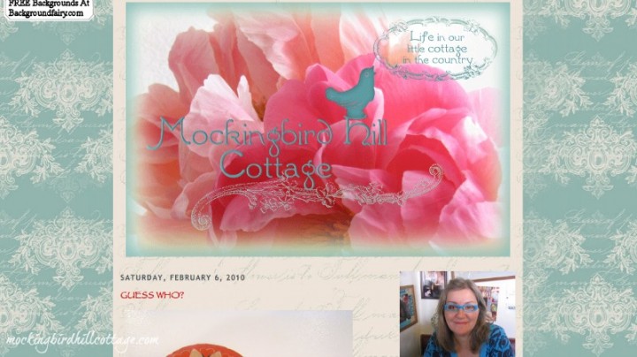
If you’ve been blogging for a while, as I have, your blog has probably gone through a lot of changes. Mine certainly has. And while I have some screenshots of Mockingbird Hill Cottage’s past incarnations, I don’t have all of them. So when I saw this link on another blog the other day, I had to investigate. It’s an internet archive called the Wayback Machine and if you enter your URL, you just might find some earlier screenshots of your blog. I found two (from the days this blog still had ‘blogspot’ in its URL:
Check out my blue glasses. Those glasses were very popular here in blogland. I had a lot of comments on them. My blogging pal Elizabeth still thinks of me as Claudia-with-the-blue-glasses. Eventually I bought another pair of glasses (not in blue) and I had to quietly phase this photo out. Confession: I have another pair of the same blue glasses now. They’re readers and are a bit too strong for my eyes at this moment. But for all of you who loved them, rest assured, I sometimes wear them – usually for crocheting.
But on to the design itself. The background was from the Background Fairy and I really liked it. The banner was based on a photo I had taken of peonies. I asked a designer friend to come up with the font in the blog title. And yes, that is the Papyrus font you see in the body of the blog. Despite all the negative stuff I have read about this font, I really liked it. Still do. And those capital letters in the post title? I resorted to them when I couldn’t figure out how to make the post title larger. Now that I know more about html, I’m pretty sure that wouldn’t be a problem. Those capital letters are now the bane of my existence. I am currently in the process of going back to each of the posts that have caps (over a year and half’s worth) and changing them to the normal combination of lowercase and uppercase, because in this new blog look, the all-caps-look is HUGE.
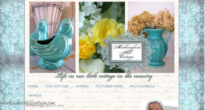
I’ve often referred to the period of time when the look of this blog was courtesy of a designer. Here it is:
Since I loved that earlier look of blue borders and faded writing I asked the designer to come up with something in that vein. I sent her 3 photos that I liked and she designed the header. I was still using Papyrus, but that eventually changed when I started using Century Gothic. During this particular incarnation of the blog, I began playing around with html. I changed font sizes, I increased the posting area, making the blue border more narrow. I eventually got rid of the ecru spidery writing background of the posting area because it was just too hard to read the posts. I added some red highlights, eventually finding my look: the combination of aqua and red. But I started feeling like a bit of an imposter because this look I wanted the designer to create no longer seemed like ‘me.’ It was too frilly. And I’m not frilly at all. I tweaked the banner because it took up too much real estate. I changed the font. When my efforts to contact the designer for some updates failed, I took control of the blog and changed everything. New banner, new borders, new everything.
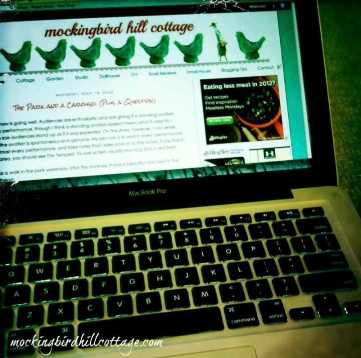
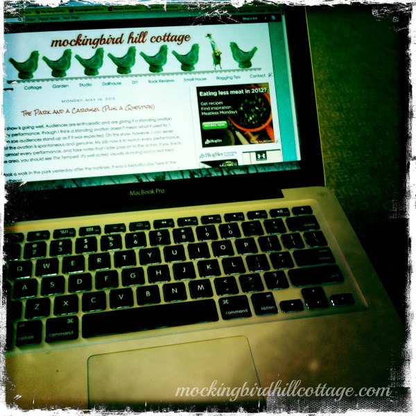
After using the usual photo collage as my banner, I eventually ended up with this (taken with my iPhone):
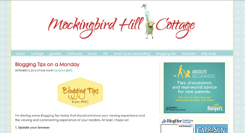
This was the look of the blog until I moved to WordPress. Now, with the possibilities of the WordPress platform, I have been able to create a look I really truly love. Clean. Colorful. Less extraneous ‘stuff.’ All of which helps to highlight the content and the photos, which is really what a blog is about. Every previous incarnation of this blog helped me to find my true voice. Everything extraneous has been sorted, purged and distilled down to this new look.
Have you checked in on your blog lately? Is it serving you well? Does the look of it fit who you really are? Does it enhance what you are writing about? Our blogs reflect us. It’s a good idea to step back and look at your blog with fresh eyes. And since we all love to decorate and fluff, why not do it to your blog as well?
Just some thoughts for today.
