Today we’re tackling the living room in a small house. Let me share my living room with you and I’ll talk about the challenges I faced when decorating the space.
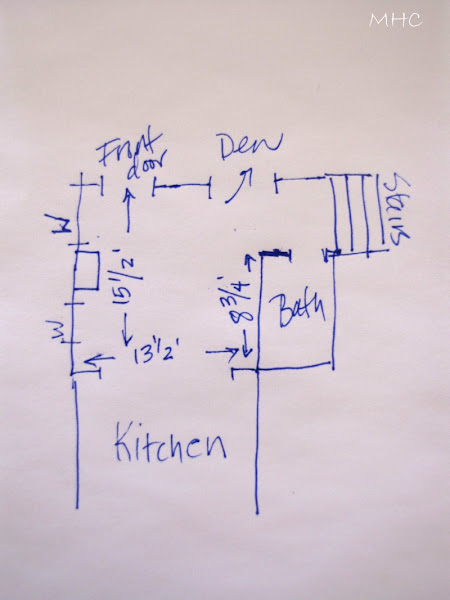
You can see why this particular part of the room has to remain relatively clear of furniture. The large,white cabinet is on the left, and a small spinet desk is tucked into an area by the stairs. That’s a closet on the right and beyond that is the doorway to the bathroom. The rug in the foreground is really Riley’s rug. He has a progressive disease that causes him great pain and he needs to sprawl out on a warm rug. Tip#1: Use what you are given to help define the living space. I’ve used the chimney as a dividing point – it’s directly across from the end of the 8 3/4′ wall, so I’ve used the line between the two points as a invisible fourth wall. It defines the seating space.
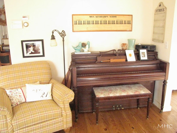
Okay, so what do we do? The biggest item in the room is the piano. There is really only one wall to place it against – the 8 3/4′ long wall on the right as we face the living room from the kitchen. There is no baseboard heating there and no windows. You don’t want a piano near any extremes in temperature. So the wall it is.
The piano has been in various positions on this wall. This latest, with it flush against the partition seems to work the best, as it allows some extra room for a chair. The chair and the piano share a floor lamp, as well. So I’ve killed two birds with one stone. Tip #2: Decide where your biggest pieces will go, then fill in the rest.
I now have only one other wall to use. The loveseat has to go there, which means the chair must be placed in the open entrance to the kitchen or on the far side of the loveseat, near the front door. Actually, we’ve done it both ways. Usually, we have our wicker rocker in this space, as well – but we’ve moved it upstairs to the bedroom. (It needs some repair.)
So, the red chair will be positioned in the opening to the kitchen. I like this because it helps to further define the living room, making it clear that it’s an entirely different space than the kitchen.
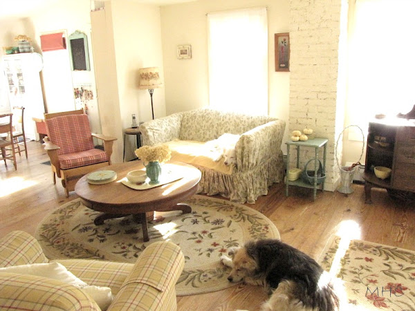
There’s the red chair. It picks up the red in the kitchen and defines the living room space. The loveseat tucks into the space created by the chimney and the partition wall. I don’t have a lot of room for side tables, so you can see I’ve used a vintage stool and a small green cottagey table.
Truth be told, I much prefer the wicker rocker in the room. Normally it would be in that area between Riley (sleeping on the floor) and the green table. Don likes the space created by its absence. I like cozy. I wonder who will win?
What about the coffee table? While it may seem large, it actually works beautifully. We love this piece which we’ve had since our San Diego days. It was refinished by a dear friend of ours and we bought it from him for $75. It’s gorgeous. When we lived in our rental we had to put it in storage. When the time came to move to the cottage and get everything out of storage, we had our doubts about whether it would work in the space. But it does. It’s large, yes, but it helps to create the cozy, intimate atmosphere I’m after. It connects the two chairs and the loveseat. Chairs can be pulled up to it, chips and dip and munchies can be laid out on it, feet can be put up on it. It’s fabulous.
Recently, we tried rearranging the space. We moved the sofa so that it was perpendicular to the wall. We replaced the large coffee table with the white coffee table (much smaller) from the den.
It didn’t work. The minute we moved the round coffee table out, the room lost it’s cottage coziness. We learned very quickly that small-sized-everything just looks puny. And it makes the room seem much smaller. Tip #3: Don’t limit yourself to small pieces of furniture. Have one or two large pieces in your small space.
Tip #4: Find balance. Yes, we’ve used big pieces as suggested in Tip #3 – we’ve got a piano and a big old coffee table in here. But those big pieces are balanced with some smaller ones, as well. And it all works together to make a cozy space.
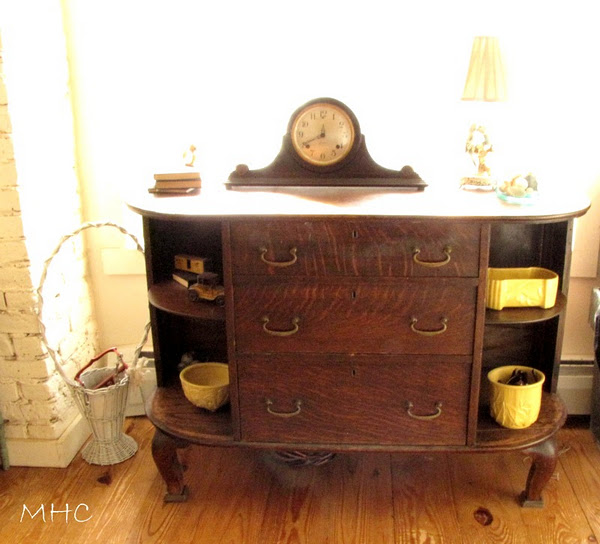
And though I talk of the entrance area as separate, the pieces of furniture that are in that end of the room are part of the greater living area. The sideboard and the white cabinet are large pieces and nicely balance the weight of the furniture in the rest of the room. And the placement of the loveseat and chair is balanced by the chair and piano on the other side of the room. The coffee table ties it all together.
Tip #5: Go with your favorite colors and patterns and don’t think you have to go with neutrals or whites to make the space work or seem bigger. I love color, as you can see. There are some dark wood pieces in the space, but they are balanced by lighter, painted pieces. One chair is a yellow and red check. The other is a red and white check. The loveseat has a pale green and white slipcover. The rugs are floral. There’s lots of green and blue pottery around. The bench by the white cabinet is blue. But it all works. If you want neutrals or whites, go for it. I don’t think, however, that it makes that much difference in the perception of the space. If everything in this space was neutral and/or white, you’d still perceive it as a small, cozy space. And you don’t need to back away from pattern, unless that is your preference. As you can see, I love pattern. It might not be everyone’s cup of tea, but it works in this space.
You have to take what you’re given and make it work. Embrace that small living room and honor it’s size. I think that to deny that this cottage is small is just plain silly. It is small. Why not celebrate it? Of course I’m biased, but I think we’ve created a charming, cozy living room. We’ve accepted the quirkiness of our space and made it work for us.
Thanks so much for stopping by. Please visit Brenda and see what she has done with her living room.
We look forward to your comments and ideas! Some of you suggested a linky party and we probably will have one or two along the way. We’ll give you plenty of warning.

