Hello, everyone! Welcome to my newly designed blog!
A while back, I started enlarging my photos. I sought the advice of a few people, among them Cindy of My Romantic Home. Because of the limitations of the Blogger template I was using, I could only enlarge photos vertically (portrait.) That was fine for a while but sometimes I wanted to shoot horizontally (landscape) and in the course of cropping and trying to adjust the size for the template I would lose part of the photo. Frustrated by the same thing, Cindy recently redesigned her blog so that the width of the posting area is greater, allowing space for either size photo. She inspired me.
I loved the look of my blog. That was what held me back. (Change is hard sometimes, isn’t it?) But to be perfectly honest, though I loved the free background, I didn’t like running into it elsewhere in blogland. I wanted my-very-own-mine-only look. I also loved the sidebar labels, signature and blog button Mandy created for me. I wanted to keep them. I finally bit the bullet and asked Amber of Sprinkles on Top if she could design a new template, background and banner. She did. I am over-the-moon about this new look! Amber captured exactly what I was looking for. She is so good at what she does and is a joy to work with.
If you’re thinking of a re-design, visit Amber’s website. She is reasonably priced and has several different packages available. Amber has designed Cindy’s blog, Elyse’s blog and many, many others. Thank you, thank you, Amber!
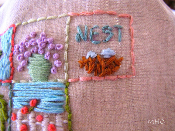
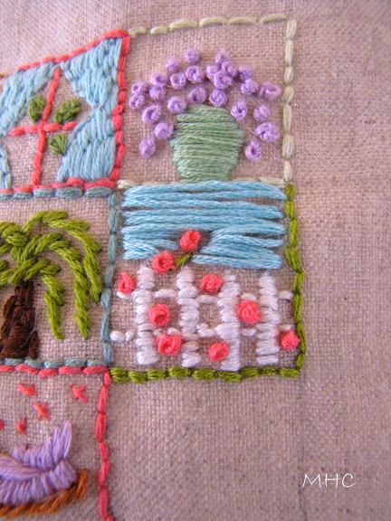
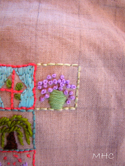
Square #10:
Pardon any white dog hairs you might see. They are part of living with a white dog that has hair as silky and fine as a cat’s. I must admit that I was stumped for a while yesterday. It took a while for a bit of ‘square inspiration’ to hit me on the head. And I have 29 to go.
Have a great day.
